Matplotlib
Topic — The foundation library. Seaborn and pandas' own
.plot()both sit on top of it, so its vocabulary is worth learning first.
import pandas as pd
import matplotlib.pyplot as plt
plt is the universal alias for matplotlib.pyplot. Every chart on this page is drawn from one
DataFrame:
df = pd.DataFrame({
    "Student": ["Arun", "Bala", "Charan", "Divya", "Esha",
                "Farah", "Gokul", "Hari", "Indhu", "Jaya"],
    "Study_Hours": [2, 3, 5, 1, 4, 3, 4, 6, 2, 5],
    "Attendance": [70, 75, 90, 60, 85, 78, 88, 95, 72, 92],
    "Marks": [55, 62, 85, 45, 78, 68, 80, 95, 58, 88],
})
The pattern
Every chart follows the same four steps:
plt.figure()                          # 1. start a new figure
plt.plot(df["Student"], df["Marks"])  # 2. draw something
plt.title("Student Marks")            # 3. label it
plt.show()                            # 4. display it
| Call | Does |
|---|---|
plt.figure() | starts a fresh canvas |
plt.plot() / .bar() / .hist() … | draws onto the current figure |
plt.title() / .xlabel() / .ylabel() | labels |
plt.show() | renders and clears |
plt.figure() matters more than it looksWithout it, every drawing call lands on the same figure, so your second chart is drawn on top
of the first. plt.show() clears the current figure, so in a script where every block ends with
show() you often get away with it — but the moment one block doesn't, charts merge.
Start every chart with plt.figure().
Line plot
plt.figure()
plt.plot(df["Student"], df["Marks"], marker="o")
plt.title("Student Marks")
plt.xlabel("Student")
plt.ylabel("Marks")
plt.show()
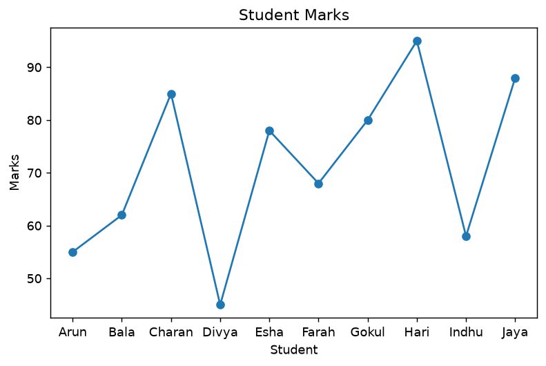
marker="o" puts a dot at each data point. Without it you get a bare line and can't tell where
the actual observations are.
The x-axis is student names in dataset order. A line implies that consecutive points are connected — that Arun becomes Bala. There's no such progression.
A line plot needs an ordered x-axis: time, an index, a measured quantity. For comparing students, use a bar chart. See Choosing a Chart.
Bar chart
plt.figure()
plt.bar(df["Student"], df["Marks"])
plt.title("Marks of Students")
plt.xlabel("Student")
plt.ylabel("Marks")
plt.show()
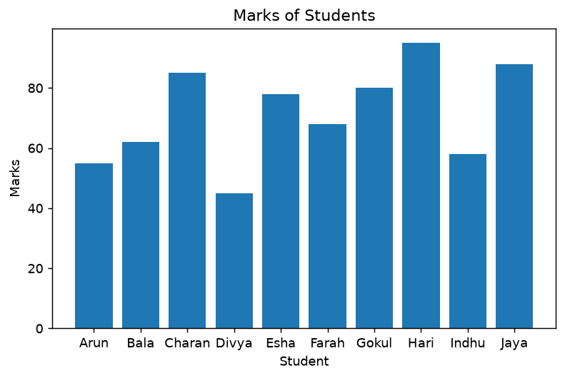
This is the right chart for this data. Bars compare magnitudes across unordered categories, and the eye reads length accurately. Hari's 95 and Divya's 45 are immediately comparable.
Note the y-axis starts at zero — matplotlib's default for bar(), and the correct behaviour.
A truncated axis makes small differences look enormous.
plt.barh() draws horizontal bars, which is better when labels are long.
Histogram
plt.figure()
plt.hist(df["Marks"], bins=5)
plt.title("Distribution of Marks")
plt.xlabel("Marks")
plt.ylabel("Number of Students")
plt.show()
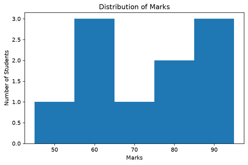
A histogram takes one numeric column, divides its range into bins, and counts how many values fall in each. The y-axis is a count, not a value.
Compare with the bar chart above: same column, completely different question. The bar chart shows each student's mark; the histogram shows how marks are spread and loses track of who's who.
bins=5 splits the 45–95 range into five intervals of 10. Try bins=3 and bins=10 on the same
data — the apparent shape changes, which is why the bin count is a choice you should make
consciously rather than accept.
Scatter plot
plt.figure()
plt.scatter(df["Study_Hours"], df["Marks"])
plt.title("Study Hours vs Marks")
plt.xlabel("Study Hours")
plt.ylabel("Marks")
plt.show()
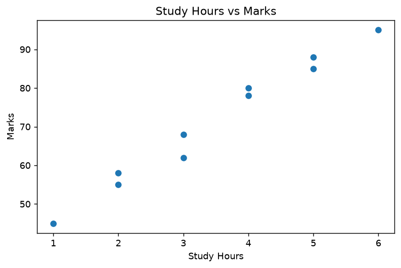
One point per student, study hours on x, marks on y. The upward trend is obvious — and this is
the 0.99 correlation from
Correlation and Covariance,
made visible.
A scatter plot shows the shape of a relationship, which a correlation coefficient can't. Here
the shape is a straight line, so 0.99 is a fair summary. When it isn't a line, the number
misleads and only the plot tells you.
Useful arguments: s= for point size, c= for colour, alpha= for transparency when points
overlap.
Pie chart
department_df = pd.DataFrame({
    "Department": ["CSE", "IT", "ECE"],
    "Students": [4, 3, 3],
})

plt.figure()
plt.pie(department_df["Students"],
        labels=department_df["Department"],
        autopct="%1.1f%%")
plt.title("Students by Department")
plt.show()
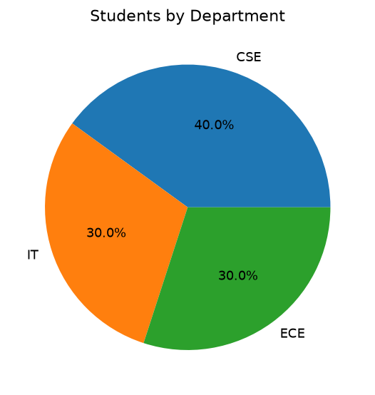
labels= names the slices; autopct="%1.1f%%" writes the percentage on each — the format string
means "one decimal place, then a literal %" (the %% escapes it).
Note the counts sum to 10, the whole dataset, so "share of total" is a meaningful question here. That's the condition a pie chart needs.
Still, three slices at 40/30/30 are hard to rank by eye. A bar chart of the same counts would be easier to read — see why pie charts are usually wrong.
Several charts in one figure
plt.subplots() returns a figure and an array of axes:
fig, axes = plt.subplots(1, 2, figsize=(10, 3.8))

axes[0].bar(df["Student"], df["Marks"])
axes[0].set_title("Marks")
axes[0].tick_params(axis="x", rotation=45)

axes[1].scatter(df["Study_Hours"], df["Marks"])
axes[1].set_title("Hours vs Marks")

plt.tight_layout()
plt.show()
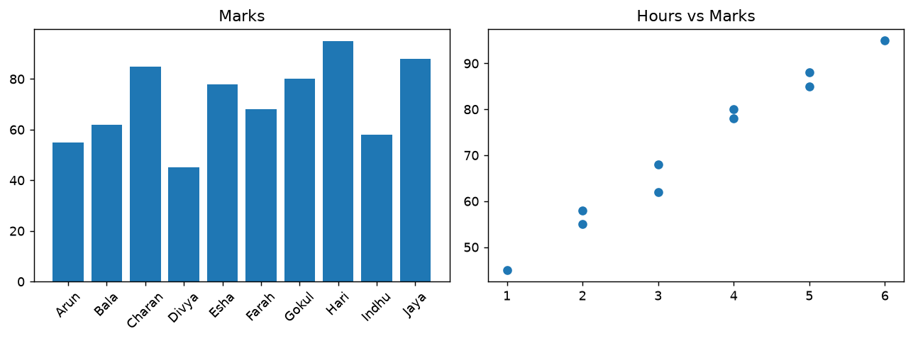
Two things change when you use axes directly:
- Methods live on the axis, not on
plt—axes[0].bar(...)rather thanplt.bar(...) - Labelling methods gain a
set_prefix —set_title(),set_xlabel(),set_ylabel()
plt.tight_layout() stops labels overlapping. rotation=45 makes the ten student names readable.
plt.title() is the pyplot interface — it acts on whatever figure is "current". ax.set_title()
is the object-oriented interface, where you say explicitly which axis you mean.
Pyplot is shorter for one chart. The object-oriented style is what you need for subplots, and it's what seaborn returns, so both are worth recognising.
Saving to a file
plt.show() opens a window. To write an image instead:
plt.savefig("chart.png", dpi=150, bbox_inches="tight")
| Argument | Does |
|---|---|
dpi=150 | resolution — 150+ for anything printed or embedded |
bbox_inches="tight" | trims surrounding whitespace and stops labels being cut off |
savefig() must come before show()show() clears the figure, so calling savefig() afterwards writes a blank image. This is a
frequent and confusing bug.
Also, in a script with no display, add matplotlib.use("Agg") before importing pyplot —
otherwise matplotlib may fail trying to open a window. Every chart on this page was rendered that
way.
Useful extras
plt.figure(figsize=(10, 4))     # size in inches
plt.grid(True)                  # gridlines
plt.legend()                    # needs label= on each plot call
plt.xticks(rotation=45)         # rotate tick labels
plt.ylim(0, 100)                # fix the axis range
plt.style.use("seaborn-v0_8")   # a nicer default look
Passing label= to a plot call and then calling plt.legend() is how you identify multiple
series on one chart. Without the label=, the legend is empty.
Common Mistakes
| # | Mistake | Result | Fix |
|---|---|---|---|
| 1 | Forgetting plt.figure() | charts drawn on top of each other | start each with figure() |
| 2 | savefig() after show() | blank image | save first |
| 3 | Line plot over categories | implies a false progression | use bar() |
| 4 | No axis labels | unreadable chart | xlabel(), ylabel(), title() |
| 5 | legend() with no label= | empty legend | plt.plot(..., label="x") |
| 6 | plt.title() on a subplot | lands on the wrong axis | ax.set_title() |
| 7 | Default dpi for embedding | blurry | dpi=150 or higher |
| 8 | No bbox_inches="tight" | labels cut off | pass it to savefig |
| 9 | hist() on a categorical column | meaningless | bar() with counts |
Summary
| Chart | Call |
|---|---|
| Line | plt.plot(x, y, marker="o") |
| Bar | plt.bar(x, y) / plt.barh(y, x) |
| Histogram | plt.hist(col, bins=n) |
| Scatter | plt.scatter(x, y) |
| Pie | plt.pie(vals, labels=..., autopct="%1.1f%%") |
| Grid of charts | fig, axes = plt.subplots(r, c) |
| Save | plt.savefig(f, dpi=150, bbox_inches="tight") |
Key takeaways
- The pattern is always:
figure()→ draw → label →show() plt.figure()prevents charts merging into one anothersavefig()beforeshow(), or you get a blank fileplt.*acts on the current figure;ax.set_*is explicit and needed for subplots- Bars compare categories, histograms show one column's distribution — not interchangeable
- The bin count changes a histogram's apparent shape; choose it deliberately
- A scatter plot shows the shape a correlation coefficient can't
- Label every axis; an unlabelled chart isn't evidence of anything
See also: Choosing a Chart · Seaborn for the same charts in less code · Plotly for interactive versions
Run It Yourself
import pandas as pd
import matplotlib
matplotlib.use("Agg")          # no display needed; remove for an interactive window
import matplotlib.pyplot as plt

df = pd.DataFrame({
    "Student": ["Arun", "Bala", "Charan", "Divya", "Esha",
                "Farah", "Gokul", "Hari", "Indhu", "Jaya"],
    "Study_Hours": [2, 3, 5, 1, 4, 3, 4, 6, 2, 5],
    "Attendance": [70, 75, 90, 60, 85, 78, 88, 95, 72, 92],
    "Marks": [55, 62, 85, 45, 78, 68, 80, 95, 58, 88],
})

# bar — the right chart for comparing students
plt.figure(figsize=(7, 4))
plt.bar(df["Student"], df["Marks"])
plt.title("Marks of Students")
plt.xlabel("Student")
plt.ylabel("Marks")
plt.xticks(rotation=45)
plt.savefig("bar.png", dpi=150, bbox_inches="tight")   # BEFORE show()
plt.close()

# histogram — distribution of one column
plt.figure(figsize=(7, 4))
plt.hist(df["Marks"], bins=5, edgecolor="white")
plt.title("Distribution of Marks")
plt.xlabel("Marks")
plt.ylabel("Number of Students")
plt.savefig("hist.png", dpi=150, bbox_inches="tight")
plt.close()

# scatter — relationship between two columns
plt.figure(figsize=(7, 4))
plt.scatter(df["Study_Hours"], df["Marks"], s=80, alpha=0.8)
plt.title("Study Hours vs Marks")
plt.xlabel("Study Hours")
plt.ylabel("Marks")
plt.grid(True, alpha=0.3)
plt.savefig("scatter.png", dpi=150, bbox_inches="tight")
plt.close()

print("wrote bar.png, hist.png, scatter.png")
print(f"correlation: {df['Study_Hours'].corr(df['Marks']):.4f}")
wrote bar.png, hist.png, scatter.png
correlation: 0.9895
Practice Questions
From the Unit 2 question bank. Tags and marks are explained on the Python index.
Unit 2 § K — Matplotlib
K1. [THEORY] What is Matplotlib, and what is pyplot? Why is it imported as plt? [3]
K2. [PLOT] For df_viz, draw a line plot of Student against Marks with circle markers, a
title, and both axis labels. [4]
K3. [PLOT] Add grid lines to K2, then customise them to be dashed, width 0.7, and
semi-transparent. [3]
K4. [PLOT] Draw a bar plot of Student against Marks, with the x-tick labels rotated
45°. [4]
K5. [PLOT] Draw the same chart as a horizontal bar plot. Name the function that
changes. [2]
K6. [PLOT] Draw a scatter plot of Study_Hours against Marks with a title, axis labels and
a grid. [3]
K7. [PLOT] Draw a histogram of Marks with 5 bins and black bar edges. [3]
K8. [THEORY] A classic viva question. What is the difference between a bar plot and a
histogram? What is on the x-axis of each, and what kind of data does each need? [4]
K9. [PLOT] Draw a pie chart of students per department, showing percentages to one decimal
place. Name the parameter that produces those percentages. [4]
K10. [THEORY] What is an exploded pie chart, and which parameter creates it? What is a
donut chart, and how do you make one? [4]
K11. [PLOT] Draw a box plot of Marks. Name the five values it displays and say how outliers
appear. [4]
K12. [PLOT] Draw multiple line plots on one set of axes — Study_Hours, Attendance and Marks
against Student — with a legend. [5]
K13. [PLOT] Draw a stacked bar chart of Study_Hours and Attendance per student. Name the
parameter that stacks the second series. [4]
K14. [THEORY] What does plt.figure() do, and why does every plot in your
Data visualization with matplotlib.py start with it? What happens if you leave it out? [3]
K15. [THEORY] What does plt.show() do? Why does the next plot start empty after you call
it? [3]
K16. [PROG] Name the function for each: chart title · x-axis label · y-axis label · grid ·
legend · x-tick rotation · figure size · saving to a file. [4]
Unit 2 § O — EDA Mini Challenges
O3. [PROG] (Lab 5.) Write one script that draws all six of these for df_viz: line, bar,
scatter, histogram, box plot (Seaborn), and an annotated correlation heatmap — each with a title
and axis labels. [10]
O6. [PROG] For df_viz, build a single figure holding four subplots in a 2×2 grid — line,
bar, scatter, histogram — each titled. Name the function that makes the grid. [6]