Plotly
Topic — Interactive charts. Same chart types as Matplotlib and Seaborn, but the output is HTML you can hover over, zoom into and pan around.
import pandas as pd
import plotly.express as px
px — plotly.express — is the high-level interface, comparable to seaborn. (plotly.graph_objects,
usually go, is the low-level one, comparable to matplotlib.)
Plotly isn't bundled with Python or with pandas:
pip install plotly
df = pd.DataFrame({
    "Student": ["Arun", "Bala", "Charan", "Divya", "Esha",
                "Farah", "Gokul", "Hari", "Indhu", "Jaya"],
    "Department": ["CSE", "IT", "CSE", "ECE", "CSE", "IT", "ECE", "CSE", "IT", "ECE"],
    "Study_Hours": [2, 3, 5, 1, 4, 3, 4, 6, 2, 5],
    "Attendance": [70, 75, 90, 60, 85, 78, 88, 95, 72, 92],
    "Marks": [55, 62, 85, 45, 78, 68, 80, 95, 58, 88],
})
Every chart on this page is a PNG export, so the interactivity — the whole point of Plotly — isn't visible here. Run the code yourself to get the real thing: hover tooltips, box zoom, pan, and click-to-hide legend entries.
The fig = px.… then fig.show() pattern
fig = px.line(df, x="Student", y="Marks", title="Student Marks")
fig.show()
Two differences from the other libraries:
- The DataFrame is the first positional argument —
px.line(df, x=..., y=...), notdata=df title=is an argument, not a separateplt.title()call
fig is an object you can keep, modify and export. fig.show() opens it in a browser, or renders
it inline in a Jupyter notebook.
Line plot
fig = px.line(df, x="Student", y="Marks", title="Student Marks")
fig.show()
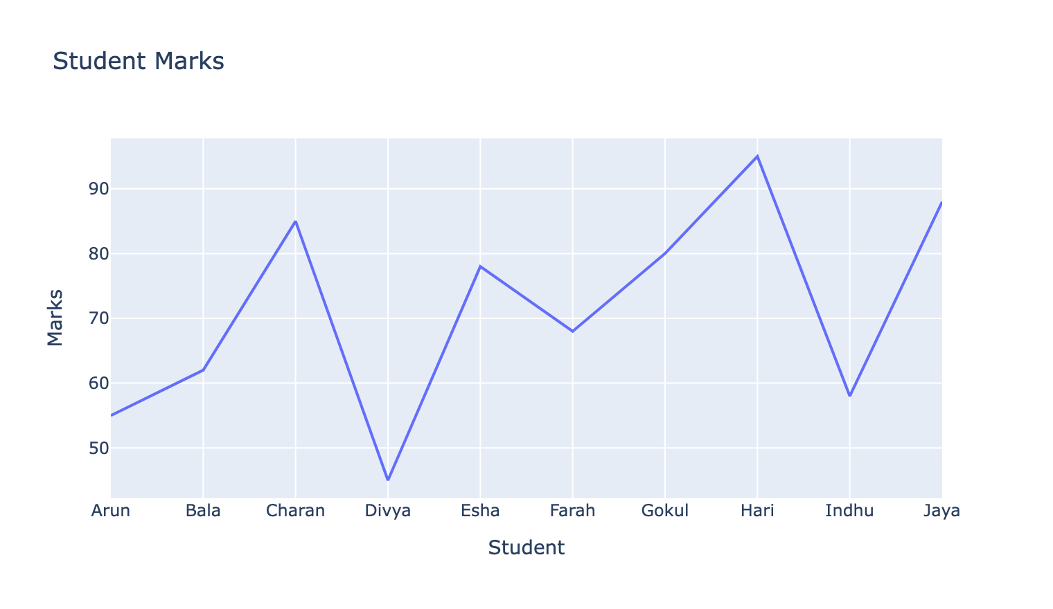
Same caveat as matplotlib's version: student names aren't an ordered axis, so the connecting line implies a progression that doesn't exist. Interactivity doesn't fix a wrong chart choice.
Note the styling is polished by default — gridlines, spacing and fonts are chosen for you.
Bar plot — with hover_data
fig = px.bar(df, x="Student", y="Marks",
             title="Marks of Students",
             hover_data=["Department", "Attendance"])
fig.show()
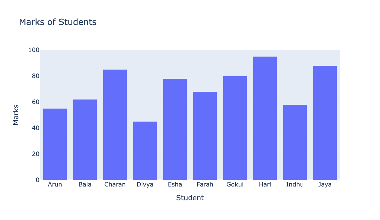
hover_data= is where Plotly earns its place. Hovering a bar shows that student's Department and
Attendance as well as their Marks — extra variables with no extra chart clutter.
In a static chart, adding two more variables means two more visual channels. Here they're hidden until asked for.
Scatter plot — colour by category
fig = px.scatter(df, x="Study_Hours", y="Marks",
                 color="Department",
                 hover_data=["Student", "Attendance"],
                 title="Study Hours vs Marks")
fig.show()
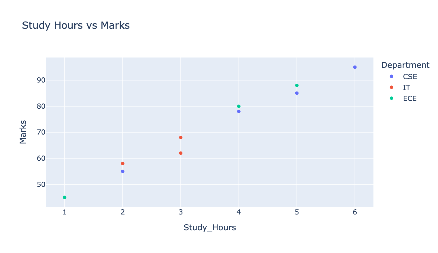
color="Department" is Plotly's equivalent of seaborn's hue= — split by category, legend
generated automatically.
The legend is clickable: click a department to hide it, double-click to isolate it. That makes an overplotted chart explorable in a way a PNG never is.
Pie chart
px.pie needs one row per slice, so count first:
department_count = df["Department"].value_counts().reset_index()
department_count.columns = ["Department", "Number_of_Students"]
print(department_count)
  Department  Number_of_Students
0        CSE                   4
1         IT                   3
2        ECE                   3
fig = px.pie(department_count,
             names="Department",
             values="Number_of_Students",
             title="Students by Department")
fig.show()
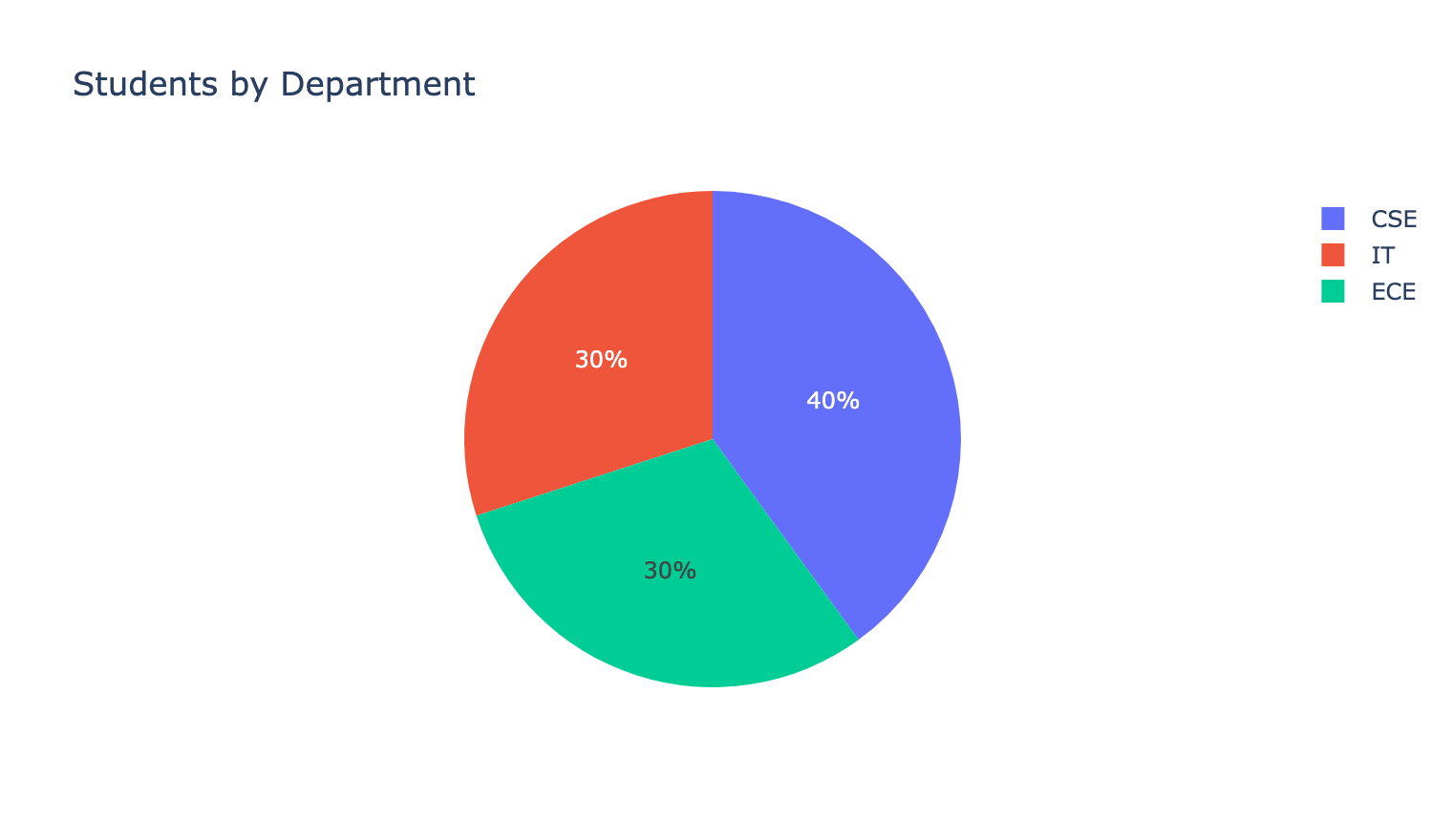
names= labels the slices, values= sizes them.
Note the two-step preparation. value_counts() returns a Series with the categories as its
index; .reset_index() turns that index into a column so px.pie can name it. Then the
columns are renamed, because reset_index() produces Department and count.
Seaborn's countplot skips all of this by counting internally — but it can't draw a pie.
Histogram
fig = px.histogram(df, x="Marks", nbins=5, title="Distribution of Marks")
fig.show()
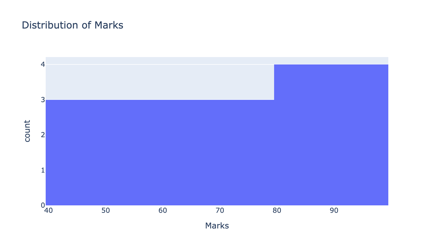
The argument is nbins, not bins. Matplotlib and seaborn use bins; Plotly uses nbins.
An easy thing to get wrong when moving between them.
Plotly treats nbins as a suggestion and may pick round bin edges nearby, so the bar count
won't always match exactly.
Box plot
fig = px.box(df, x="Department", y="Marks",
             title="Marks Distribution by Department")
fig.show()
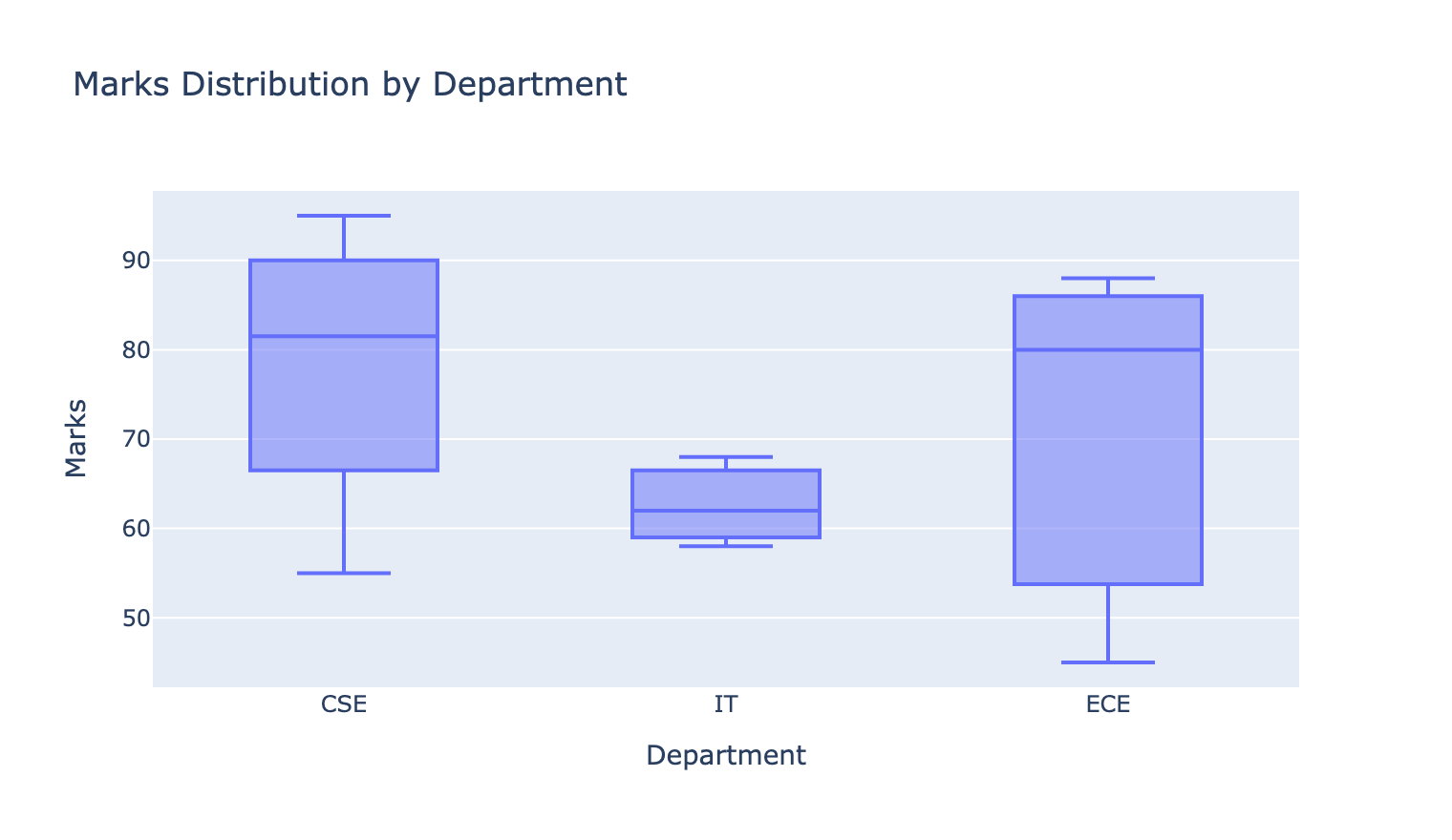
Same five-number summary as seaborn's box plot — and hovering reads the actual Q1, median, Q3 and whisker values off the box rather than making you estimate them from the axis.
That's a genuine gain: a static box plot tells you the median is "about 62", while this one tells you it's 62.
Violin plot — with the box and points shown
fig = px.violin(df, x="Department", y="Marks",
                box=True, points="all",
                title="Marks Distribution by Department")
fig.show()
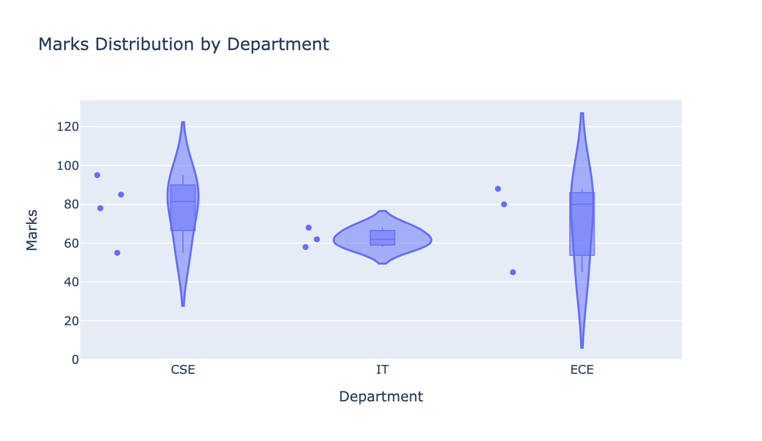
Two useful arguments:
| Argument | Does |
|---|---|
box=True | draws the box plot inside the violin |
points="all" | plots every individual observation alongside |
points="all" is worth defaulting to on small data. It shows there are only 3–4 students per
department, which stops you over-reading the violin's smoothed shape — the caveat that
seaborn's violin page has to state in words.
Bubble chart
fig = px.scatter(df, x="Study_Hours", y="Marks",
                 size="Attendance",
                 color="Department",
                 hover_name="Student",
                 title="Study Hours, Marks and Attendance")
fig.show()
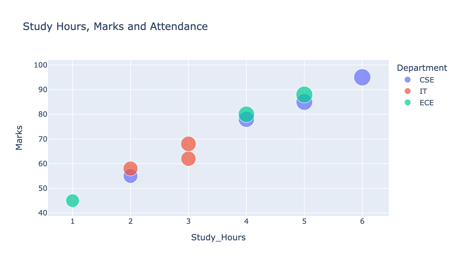
Five variables on one chart:
| Channel | Variable |
|---|---|
| x position | Study_Hours |
| y position | Marks |
| bubble size | Attendance |
| colour | Department |
| hover title | Student |
hover_name= puts the student's name as the tooltip heading, so every point is identifiable
without a label cluttering the plot.
This is about the limit of what one chart can carry. Beyond five channels it stops being readable regardless of the library.
Exporting
Interactive HTML
fig.write_html("chart.html")
A self-contained file that keeps all the interactivity. This is the format that makes Plotly worth using — email it, or host it, and the recipient can explore.
Static image
fig.write_image("chart.png", width=760, height=440, scale=2)
Needs an extra package:
pip install kaleido
scale=2 doubles the resolution, which matters for embedding. Every image on this page was
produced this way.
A static export loses hover, zoom, pan and the clickable legend. If the output has to be an image — a PDF, a printed report, a document — Matplotlib or Seaborn will give you a better-looking one with less setup.
Choose Plotly when the audience will interact. Choose Matplotlib or Seaborn when they'll read.
Plotly vs Seaborn vs Matplotlib
| Matplotlib | Seaborn | Plotly | |
|---|---|---|---|
| DataFrame argument | columns | data=df | df positional |
| Category colour | manual | hue= | color= |
| Histogram bins | bins= | bins= | nbins= |
| Title | plt.title() | plt.title() | title= argument |
| Statistical aggregation | manual | automatic | some |
| Hover tooltips | ❌ | ❌ | ✅ |
| Zoom / pan | ❌ | ❌ | ✅ |
| Output | image | image | HTML |
| Extra install | bundled with most setups | pip install seaborn | pip install plotly (+ kaleido) |
Note the argument-name differences. Moving a chart between libraries means adjusting more than the function name.
Common Mistakes
| # | Mistake | Result | Fix |
|---|---|---|---|
| 1 | bins= on a Plotly histogram | ignored | nbins= |
| 2 | data=df | TypeError | pass df positionally |
| 3 | plt.title() after px.… | does nothing | title= argument |
| 4 | px.pie on raw rows | one slice per row | value_counts().reset_index() first |
| 5 | Forgetting .reset_index() | categories stuck in the index | reset, then rename |
| 6 | write_image without kaleido | ValueError | pip install kaleido |
| 7 | write_html for a printed report | can't print HTML | write_image, or use matplotlib |
| 8 | Assuming interactivity survives export | PNG is static | write_html to keep it |
| 9 | Six or more variables on one chart | unreadable | split into several |
Summary
| Chart | Call |
|---|---|
| Line | px.line(df, x=, y=, title=) |
| Bar | px.bar(df, x=, y=, hover_data=[...]) |
| Scatter | px.scatter(df, x=, y=, color=) |
| Bubble | px.scatter(df, x=, y=, size=, color=, hover_name=) |
| Pie | px.pie(counts, names=, values=) |
| Histogram | px.histogram(df, x=, nbins=) |
| Box | px.box(df, x=, y=) |
| Violin | px.violin(df, x=, y=, box=True, points="all") |
| Show | fig.show() |
| Save interactive | fig.write_html("f.html") |
| Save image | fig.write_image("f.png", scale=2) |
Key takeaways
fig = px.chart(df, ...)thenfig.show()— the DataFrame is positional, the title an argumenthover_data=adds variables without adding clutter — Plotly's main advantagecolor=is Plotly'shue=, and the legend is clickable to filternbins=, notbins=px.pieneeds pre-counted rows:value_counts().reset_index()then renamepoints="all"on a violin shows how little data there actually is- A bubble chart carries five variables; that's the practical ceiling
write_htmlkeeps interactivity;write_imageneedskaleidoand throws it away- Interactive for exploring, static for reading — pick the library from that
See also: Choosing a Chart · Matplotlib · Seaborn · Exploratory Data Analysis
Run It Yourself
import pandas as pd
import plotly.express as px

df = pd.DataFrame({
    "Student": ["Arun", "Bala", "Charan", "Divya", "Esha",
                "Farah", "Gokul", "Hari", "Indhu", "Jaya"],
    "Department": ["CSE", "IT", "CSE", "ECE", "CSE", "IT", "ECE", "CSE", "IT", "ECE"],
    "Study_Hours": [2, 3, 5, 1, 4, 3, 4, 6, 2, 5],
    "Attendance": [70, 75, 90, 60, 85, 78, 88, 95, 72, 92],
    "Marks": [55, 62, 85, 45, 78, 68, 80, 95, 58, 88],
})

# pie charts need one row per slice
counts = df["Department"].value_counts().reset_index()
counts.columns = ["Department", "Number_of_Students"]
print("prepared for px.pie:")
print(counts)

# bubble chart — five variables at once
fig = px.scatter(df, x="Study_Hours", y="Marks",
                 size="Attendance", color="Department",
                 hover_name="Student",
                 title="Study Hours, Marks and Attendance")

fig.write_html("bubble.html")          # keeps interactivity
print("\nwrote bubble.html — open it and hover a point")

# box plot, hover reads exact quartiles
fig2 = px.box(df, x="Department", y="Marks",
              title="Marks Distribution by Department")
fig2.write_html("box.html")
print("wrote box.html")

# what the box plot is showing
print("\nthe numbers behind the boxes:")
print(df.groupby("Department")["Marks"].describe()[["count", "25%", "50%", "75%"]])
prepared for px.pie:
  Department  Number_of_Students
0        CSE                   4
1         IT                   3
2        ECE                   3

wrote bubble.html — open it and hover a point
wrote box.html

the numbers behind the boxes:
            count    25%   50%   75%
Department
CSE           4.0  72.25  81.5  87.5
ECE           3.0  62.50  80.0  84.0
IT            3.0  60.00  62.0  65.0
Practice Questions
From the Unit 2 question bank. Tags and marks are explained on the Python index.
Unit 2 § M — Plotly
M1. [THEORY] What is Plotly, and what one thing does it give you that Matplotlib and Seaborn
do not? [3]
M2. [PROG] Import Plotly Express and draw an interactive line plot of Student against
Marks. [3]
M3. [PROG] Draw an interactive bar plot of Student against Marks, showing Department and
Attendance on hover. Name the parameter. [4]
M4. [PROG] Draw an interactive scatter plot of Study_Hours against Marks, coloured by
Department, with the student's name on hover. [4]
M5. [PROG] Draw an interactive pie chart of students per department. [4]
Your Plotly.py needs .value_counts().reset_index() first. Explain why.
M6. [PROG] Draw an interactive histogram of Marks with 5 bins. Name the parameter Plotly
uses instead of Matplotlib's bins. [3]
M7. [PROG] Draw an interactive box plot of Marks by Department. [3]
M8. [PROG] Draw an interactive violin plot of Marks by Department, with the box drawn
inside and all points shown. [4]
M9. [PROG] Draw a bubble chart — Study_Hours against Marks, bubble size by Attendance,
colour by Department, name on hover. [5]
M10. [THEORY] Matplotlib ends with plt.show(), Plotly with fig.show(). What is different
about what each of those two calls actually produces? [3]
Viva
- What is the one thing Plotly gives you that Matplotlib does not?