Seaborn
Topic — Statistical plotting built on Matplotlib. Same charts, far less code — and it computes statistics for you rather than making you do it first.
import pandas as pd
import matplotlib.pyplot as plt
import seaborn as sns
All three imports are needed. sns draws; plt still handles figures, titles and show(),
because seaborn returns matplotlib axes. They're one system.
df = pd.DataFrame({
    "Student": ["Arun", "Bala", "Charan", "Divya", "Esha",
                "Farah", "Gokul", "Hari", "Indhu", "Jaya"],
    "Department": ["CSE", "IT", "CSE", "ECE", "CSE", "IT", "ECE", "CSE", "IT", "ECE"],
    "Study_Hours": [2, 3, 5, 1, 4, 3, 4, 6, 2, 5],
    "Attendance": [70, 75, 90, 60, 85, 78, 88, 95, 72, 92],
    "Marks": [55, 62, 85, 45, 78, 68, 80, 95, 58, 88],
})
The data=, x=, y= pattern
Every seaborn function takes the whole DataFrame plus column names:
sns.barplot(data=df, x="Department", y="Marks")
Compare matplotlib, where you extract the columns yourself and compute any statistics first. This difference — names instead of values — is what makes seaborn short.
Bar plot — it aggregates for you
plt.figure()
sns.barplot(data=df, x="Department", y="Marks")
plt.title("Average Marks by Department")
plt.xlabel("Department")
plt.ylabel("Average Marks")
plt.show()
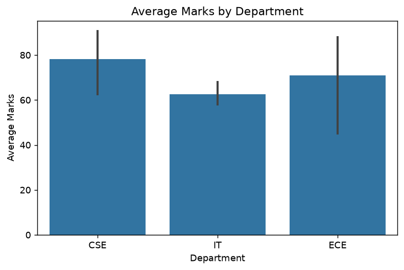
There are ten rows but three bars. Seaborn grouped by Department and plotted the mean of
Marks in each group — the equivalent of
df.groupby("Department")["Marks"].mean()
from Selecting and Transforming, done implicitly.
The vertical line on each bar is a 95% confidence interval, bootstrapped from the values in that group. Long bars mean high uncertainty — and with 3–4 students per group, they're long.
sns.barplot shows the mean, not the totalplt.bar plots exactly the numbers you hand it. sns.barplot aggregates, defaulting to the
mean. If you wanted sums you'd get averages without being told.
Pass estimator="sum" for totals, or errorbar=None to drop the confidence interval.
That confidence interval is doing useful work here: it's the visual version of the caution from EDA that groups of 3 and 4 can't support strong claims.
Count plot — frequencies
plt.figure()
sns.countplot(data=df, x="Department")
plt.title("Number of Students in Each Department")
plt.xlabel("Department")
plt.ylabel("Number of Students")
plt.show()
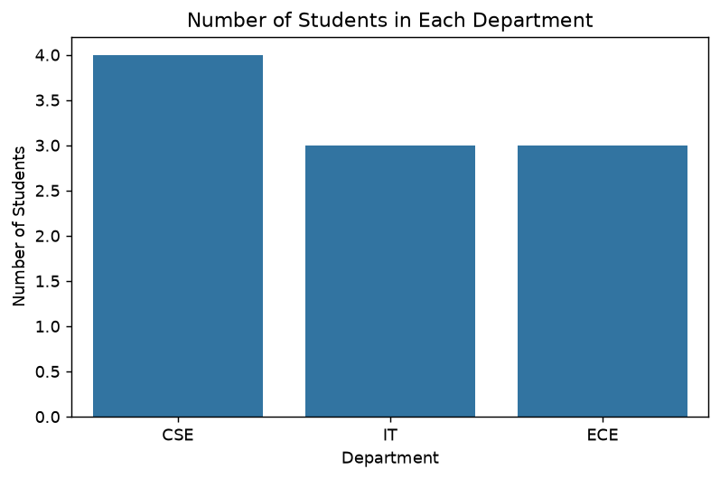
countplot needs only x= — it counts rows per category. This is
value_counts() as a chart: CSE 4,
IT 3, ECE 3.
Note it takes no y=. The y-axis is the count.
Histogram
plt.figure()
sns.histplot(data=df, x="Marks", bins=5)
plt.title("Distribution of Marks")
plt.xlabel("Marks")
plt.ylabel("Frequency")
plt.show()
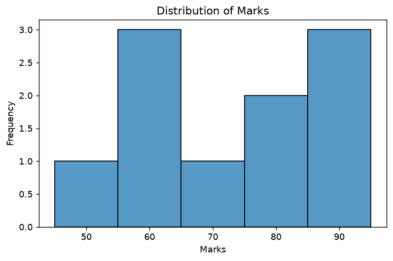
Same as plt.hist() with better defaults — note the visible bar edges, which matplotlib omits.
kde=True overlays a smooth density curve. hue="Department" splits the histogram by category,
which is the kind of thing that takes real work in bare matplotlib.
Scatter plot
plt.figure()
sns.scatterplot(data=df, x="Study_Hours", y="Marks")
plt.title("Study Hours vs Marks")
plt.xlabel("Study Hours")
plt.ylabel("Marks")
plt.show()
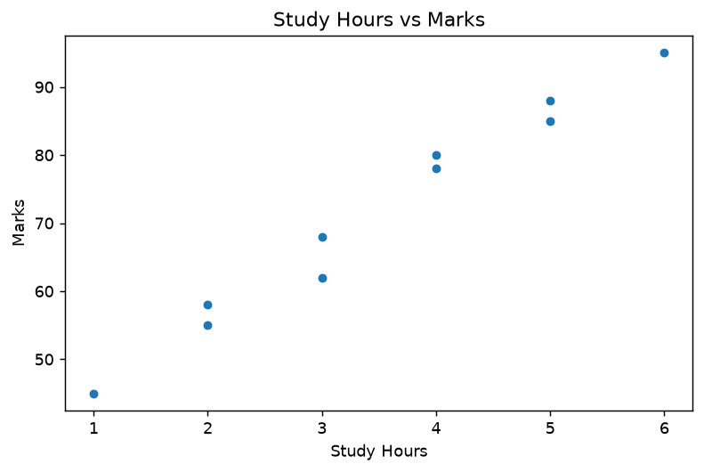
Adding dimensions with hue and size
plt.figure()
sns.scatterplot(data=df, x="Study_Hours", y="Marks",
                hue="Department", size="Attendance")
plt.title("Study Hours vs Marks by Department")
plt.show()
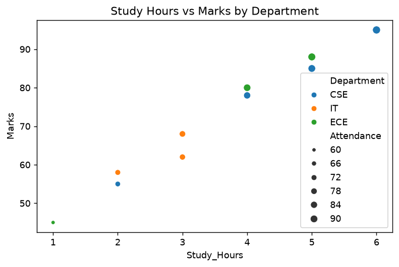
Four variables on one chart: x, y, colour and point size — with the legend generated automatically. This is seaborn's real advantage. The same chart in matplotlib means mapping departments to colours by hand and building the legend yourself.
Line plot — it aggregates too
plt.figure()
sns.lineplot(data=df, x="Study_Hours", y="Marks")
plt.title("Study Hours vs Marks")
plt.xlabel("Study Hours")
plt.ylabel("Marks")
plt.show()
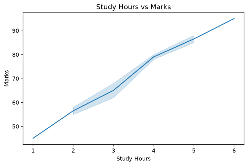
Where two students share the same Study_Hours, seaborn plots the mean and draws a shaded
confidence band around it. That's why the line is smooth despite duplicate x-values, and why
there's a band at all.
Note this line plot is legitimate: Study_Hours is a genuinely ordered numeric axis, unlike
the student-names line plot.
Box plot
plt.figure()
sns.boxplot(data=df, x="Department", y="Marks")
plt.title("Marks Distribution by Department")
plt.xlabel("Department")
plt.ylabel("Marks")
plt.show()
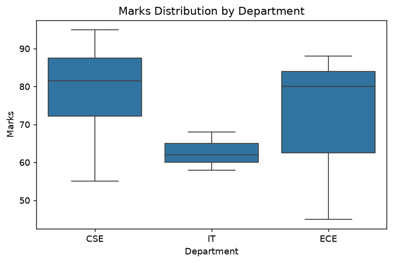
Three distributions in one chart. Each box spans Q1 to Q3, the line inside is the median, and the
whiskers reach 1.5 × IQR — the
quartiles and outlier fence
drawn rather than tabulated.
Read the widths, not just the medians. IT's box is tight (58–68) while ECE's stretches from 45
to 88. Those two groups have similar medians and completely different consistency — a fact that
groupby().mean() hides entirely and this chart makes obvious at a glance.
This is the strongest argument for box plots: comparing spread across groups is exactly what they're for.
Violin plot
plt.figure()
sns.violinplot(data=df, x="Department", y="Marks")
plt.title("Marks Distribution by Department")
plt.xlabel("Department")
plt.ylabel("Marks")
plt.show()
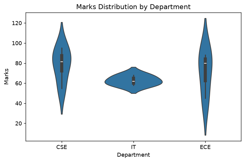
A violin plot replaces the box with the distribution's shape — width shows where values cluster. It reveals things a box hides, like two separate peaks.
With 3–4 points per group the shapes here are mostly the smoother's guesswork rather than real structure. Violins need reasonable sample sizes to mean anything; box plots degrade more honestly.
Correlation heatmap
numeric_data = df[["Study_Hours", "Attendance", "Marks"]]
correlation = numeric_data.corr()

plt.figure()
sns.heatmap(correlation, annot=True)
plt.title("Correlation Heatmap")
plt.show()
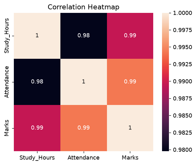
The correlation matrix as colour.
annot=True writes the numbers into the cells — without it you get colour only, and can't read
exact values.
All three correlations are 0.98–0.99, so the whole map is nearly one colour. That's a true picture of this data, and it also shows the default palette's weakness.
A better heatmap
sns.heatmap(correlation, annot=True, cmap="coolwarm",
            vmin=-1, vmax=1, fmt=".2f")
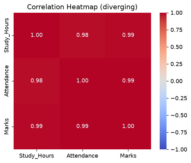
Three changes, each worth making a habit:
| Argument | Why |
|---|---|
cmap="coolwarm" | diverging palette — negative and positive read differently |
vmin=-1, vmax=1 | fixes the scale to correlation's full range |
fmt=".2f" | two decimals instead of the default's long floats |
vmin/vmax, the colour scale is relativeBy default seaborn scales colour to the values present. A matrix whose correlations run 0.95 to 0.99 gets the full palette, making trivial differences look dramatic — and a correlation of 0.95 appears in the same colour that would mean −1.0 elsewhere.
For correlations, always pin the scale to −1…+1. Then colour means the same thing in every heatmap you draw.
Pair plot
sns.pairplot(df[["Study_Hours", "Attendance", "Marks"]])
plt.show()
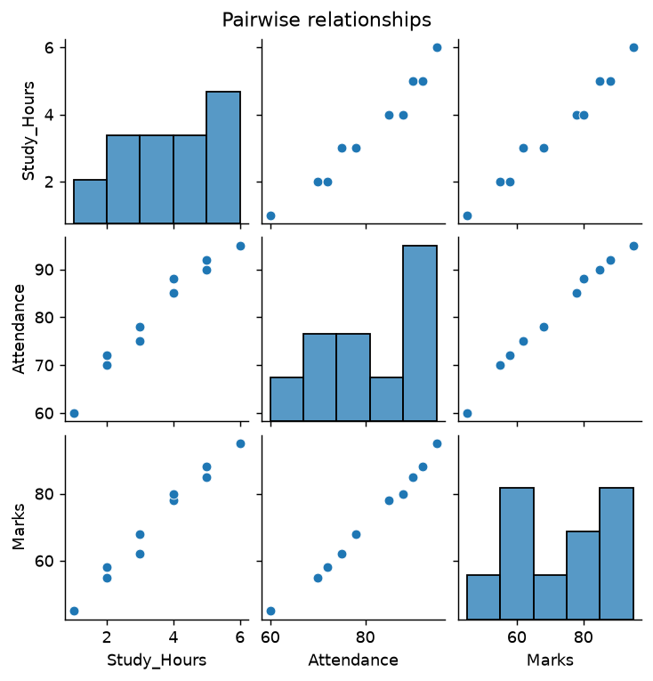
Every numeric column scattered against every other, with distributions on the diagonal. One call gives the whole picture, which makes it a good first move after EDA.
This is where the near-linear relationships become undeniable — all three off-diagonal panels show essentially straight lines.
pairplot returns a figure, not axesUnlike the others, sns.pairplot() creates its own multi-panel figure. So plt.figure()
beforehand does nothing, and plt.title() afterwards won't land where you expect. Use
g = sns.pairplot(...) then g.figure.suptitle("...").
It also scales badly — n columns means n² panels.
Styling
sns.set_theme(style="whitegrid")     # whitegrid, darkgrid, white, dark, ticks
sns.set_palette("deep")              # deep, muted, pastel, colorblind
sns.set_theme() changes matplotlib's defaults globally, so it improves your bare matplotlib
charts too. palette="colorblind" is worth defaulting to.
For anything seaborn doesn't expose, drop to matplotlib — plt.ylim(), plt.xticks(rotation=45)
and the rest all work, because it's the same axes underneath.
Matplotlib or Seaborn?
| Task | Matplotlib | Seaborn |
|---|---|---|
| Mean per category | groupby then plt.bar | sns.barplot |
| Colour by category | map colours by hand | hue="col" |
| Box plot per group | build the groups | sns.boxplot(x=, y=) |
| Correlation heatmap | imshow plus annotation loop | sns.heatmap(annot=True) |
| Confidence intervals | compute them yourself | automatic |
| Full control of a custom chart | ✅ | escapes to matplotlib |
Seaborn for statistical charts; matplotlib for control. Not competitors — layers.
Common Mistakes
| # | Mistake | Result | Fix |
|---|---|---|---|
| 1 | Expecting barplot to plot raw values | it plots the mean | estimator="sum", or plt.bar |
| 2 | Not knowing about the error bars | mistaken for data | errorbar=None |
| 3 | Passing columns instead of names | sns.barplot(df["a"], df["b"]) | data=df, x="a", y="b" |
| 4 | Forgetting to import matplotlib.pyplot | no show(), no titles | import both |
| 5 | heatmap without annot=True | colour with no values | pass it |
| 6 | heatmap without vmin/vmax | relative scale exaggerates | pin to −1…1 |
| 7 | plt.title() after pairplot | wrong figure | g.figure.suptitle() |
| 8 | Violin plot on tiny groups | shape is invented | box plot instead |
| 9 | countplot with y= a numeric column | not what it's for | barplot |
Summary
| Chart | Call |
|---|---|
| Mean per category | sns.barplot(data=, x=, y=) |
| Row count per category | sns.countplot(data=, x=) |
| Distribution | sns.histplot(data=, x=, bins=) |
| Relationship | sns.scatterplot(data=, x=, y=, hue=, size=) |
| Trend with CI | sns.lineplot(data=, x=, y=) |
| Spread per group | sns.boxplot(data=, x=, y=) |
| Distribution shape | sns.violinplot(data=, x=, y=) |
| Correlation matrix | sns.heatmap(df.corr(), annot=True, cmap="coolwarm", vmin=-1, vmax=1) |
| Everything vs everything | sns.pairplot(df) |
| Theme | sns.set_theme(style="whitegrid") |
Key takeaways
data=df, x="col", y="col"— column names, not extracted values- Seaborn returns matplotlib axes, so
plt.title()andplt.show()still apply sns.barplotplots the mean and adds a 95% confidence interval — not raw valueshue=andsize=add a third and fourth variable, with automatic legends- Box plots compare spread: IT sits at 58–68 while ECE spans 45–88
- Always give a correlation heatmap
annot=True,cmap="coolwarm"andvmin=-1, vmax=1 - Violin plots need real sample sizes; with 3 points the shape is invented
pairplotmakes its own figure and scales as n²
See also: Matplotlib for the layer underneath · Choosing a Chart · Plotly · Correlation and Covariance
Run It Yourself
import pandas as pd
import matplotlib
matplotlib.use("Agg")
import matplotlib.pyplot as plt
import seaborn as sns

sns.set_theme(style="whitegrid")

df = pd.DataFrame({
    "Student": ["Arun", "Bala", "Charan", "Divya", "Esha",
                "Farah", "Gokul", "Hari", "Indhu", "Jaya"],
    "Department": ["CSE", "IT", "CSE", "ECE", "CSE", "IT", "ECE", "CSE", "IT", "ECE"],
    "Study_Hours": [2, 3, 5, 1, 4, 3, 4, 6, 2, 5],
    "Attendance": [70, 75, 90, 60, 85, 78, 88, 95, 72, 92],
    "Marks": [55, 62, 85, 45, 78, 68, 80, 95, 58, 88],
})

# what barplot is actually plotting
print("sns.barplot plots these means:")
print(df.groupby("Department")["Marks"].mean().round(2))

plt.figure(figsize=(7, 4))
sns.boxplot(data=df, x="Department", y="Marks")
plt.title("Marks Distribution by Department")
plt.savefig("box.png", dpi=150, bbox_inches="tight")
plt.close()

plt.figure(figsize=(7, 4))
sns.scatterplot(data=df, x="Study_Hours", y="Marks",
                hue="Department", size="Attendance")
plt.title("Study Hours vs Marks by Department")
plt.savefig("scatter.png", dpi=150, bbox_inches="tight")
plt.close()

plt.figure(figsize=(5.5, 4.4))
sns.heatmap(df[["Study_Hours", "Attendance", "Marks"]].corr(),
            annot=True, cmap="coolwarm", vmin=-1, vmax=1, fmt=".2f")
plt.title("Correlation Heatmap")
plt.savefig("heatmap.png", dpi=150, bbox_inches="tight")
plt.close()

print("\nwrote box.png, scatter.png, heatmap.png")

# the spread that the means hide
print("\nspread per department — medians are close, ranges are not:")
print(df.groupby("Department")["Marks"].agg(["median", "min", "max", "count"]))
sns.barplot plots these means:
Department
CSE    78.25
ECE    71.00
IT     62.67
Name: Marks, dtype: float64

wrote box.png, scatter.png, heatmap.png

spread per department — medians are close, ranges are not:
            median  min  max  count
Department
CSE           81.5   55   95      4
ECE           80.0   45   88      3
IT            62.0   58   68      3
Practice Questions
From the Unit 2 question bank. Tags and marks are explained on the Python index.
Unit 2 § L — Seaborn
L1. [THEORY] What is Seaborn, and what is it built on top of? [2]
L2. [THEORY] Give three concrete advantages of Seaborn over plain Matplotlib. [3]
L3. [THEORY] Seaborn plots take data=df, x="...", y="...", while Matplotlib takes
df["x"], df["y"]. Explain the difference in approach and why Seaborn's suits DataFrames. [3]
L4. [PLOT] Draw a Seaborn bar plot of Department against Marks. [3]
L5. [OUT] sns.barplot(data=df_viz, x="Department", y="Marks") gets 4 CSE rows but draws only
one CSE bar. What does that bar's height represent, and what are the little vertical lines on
top? [4]
L6. [PLOT] Draw a count plot of Department. [2]
L7. [THEORY] What is the difference between sns.barplot() and sns.countplot()? Why does
countplot need only an x? [3]
L8. [PLOT] Draw a Seaborn histogram of Marks with 5 bins. [2]
L9. [PLOT] Draw a Seaborn scatter plot of Study_Hours against Marks, colouring the points
by Department. Name the parameter that does the colouring. [4]
L10. [PLOT] Draw a box plot of Marks grouped by Department. [3]
L11. [PLOT] Draw a violin plot of Marks by Department. [3]
L12. [THEORY] What does a violin plot show that a box plot does not? [3]
L13. [PLOT] Draw a strip plot of Marks by Department, then add Department as a
hue. [3]
L14. [THEORY] What is a swarm plot, and what problem with the strip plot does it
solve? [3]
L15. [PLOT] Draw a pair plot of the numeric columns of df_viz. [3]
L16. [THEORY] For a DataFrame with 4 numeric columns, how many subplots does pairplot()
produce? What is on the diagonal? [3]
L17. [PLOT] Compute the correlation matrix of the numeric columns of df_viz and draw it as a
heatmap with the values annotated and black cell borders. [5]
L18. [THEORY] What is the point of annot=True on a heatmap? What is lost without it? [2]
L19. [THEORY] What is a distribution plot, and what does KDE add to a plain
histogram? [3]
L20. [THEORY] What does split=True do on a violin plot, and when is it useful? [3]
Viva
- What is Seaborn built on top of?
- Which parameter colours a Seaborn plot by a categorical column?
- What does
annot=Truedo on a heatmap?